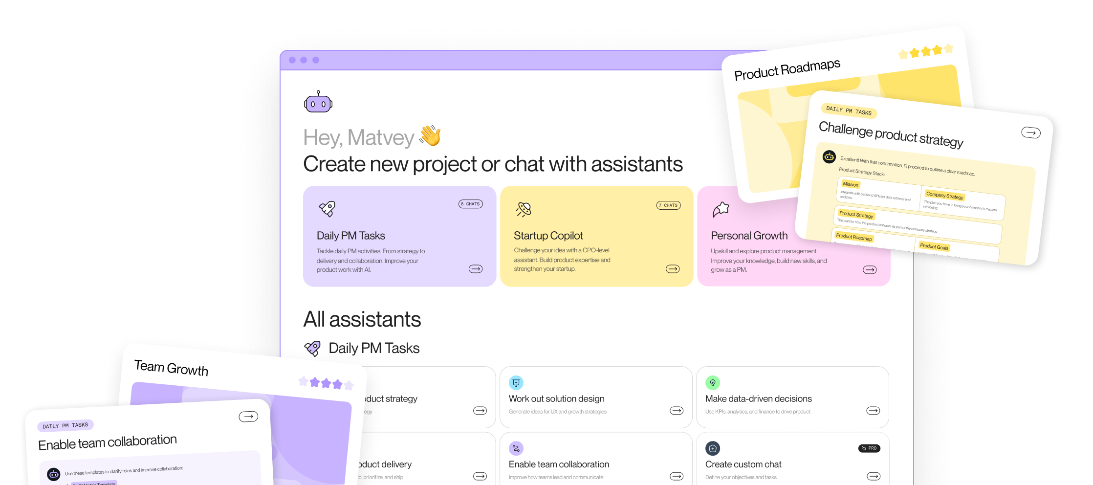





A green dashboard is the most dangerous screen in an AI product. Sessions look stable, latency is fine, and the model answers every request. Meanwhile users edit a third of its outputs before using them, and next quarter's retention already reflects the trust they're losing.
Traditional product analytics was built for deterministic software. A user clicks checkout, checkout opens, and the event count tells you the feature works. AI features break the assumption behind every one of those charts: the same input can produce a different output on every run, and output quality varies by user, by prompt, and by model version.
AI product analytics closes that gap. It measures two things at once: what the model does, and what people do with what the model produces. Miss either half and the dashboard turns green while the feature fails.
What AI product analytics is
AI product analytics extends standard product measurement to features whose output is probabilistic. It answers questions a funnel chart can't: Is the model's quality holding up in production? Do users trust the output enough to act on it? Is the feature changing retention, or only usage?
The difference from traditional analytics shows up in three places:
- Usage stops equaling value. Time spent in a chat feature can mean the model nailed the task or that the user is on their fifth retry. Raw engagement can climb while satisfaction falls.
- Quality moves without a release. Classic software behaves the same until you ship a change. A model's behavior shifts with data drift, prompt changes, and provider updates, so measurement has to be continuous, not per-release.
- The unit of analysis changes. You're no longer only tracking sessions and clicks. You're tracking generations: each output, what it cost, which model version produced it, and what the user did with it.
A 2022 study published in Scientific Reports tracked machine learning models across four industries and found 91 percent degraded over time when left without retraining. Drift is the default condition of a deployed model, not an edge case.
Two layers of measurement: model signals and user behavior
Every working AI analytics setup measures two layers and joins them.
The technical layer captures model behavior: response latency, token cost per generation, eval scores against a fixed test set, guardrail triggers, and drift indicators. These signals usually live in tracing and observability tools such as LangSmith, Braintrust, or Arize, and the engineering team owns them.
The adoption layer captures user behavior: activation on the AI feature, repeat usage, task completion, retention of users who adopted it, and what users do with each output. These signals live in product analytics, and the PM owns them.
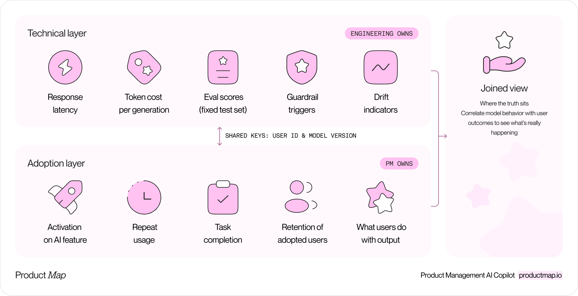
Each layer lies on its own. Eval scores can be excellent while users abandon the feature, because the model solves a job nobody has. Adoption can look healthy while drift accumulates, because users haven't noticed the quality slide yet. The join is where the truth sits.
The join has a practical requirement most teams discover too late: every behavioral event needs the model version and prompt template ID attached. Logging those two fields from day one costs an afternoon. Backfilling them after six months of events is close to impossible, and without them you can't answer the first question every incident raises: did quality drop because of the model change or the prompt change?
Override rate and the metrics replacing engagement
For AI features, the sharpest signal is the override rate: the share of outputs users reject or materially edit before using. Every generation ends in one of three user actions, and each one is an event worth logging:
- Accept: the user takes the output as produced. Rising accept rates mean growing trust.
- Edit: the user keeps the output but reworks it. Edits are the richest signal you have, because the diff between generated and final shows exactly where the model falls short.
- Reject: the user discards the output or abandons the task. Spikes here are your earliest warning, weeks before retention moves.
GitHub has reported developers accept roughly 30 percent of Copilot's suggestions. That number sounds low until you treat it as a baseline instead of a verdict. The absolute rate matters less than the trend: an override rate drifting up across releases is a model quality problem announcing itself before any business metric reacts.
Two more metrics complete the core set. Drift indicators compare current model behavior against a baseline, through scheduled eval runs and through override trends split by cohort. And retention impact compares users who adopted the AI feature against similar users who didn't; if the adopters don't retain better, the feature is a cost line, not a moat. Pair that view with unit cost per generation, because an AI feature can grow usage and lose money at the same time.
Headless analytics: dashboards built to your requirements
Packaged analytics tools ship a fixed interface: funnels, retention curves, and path analysis, designed around the click-era assumption one event stream of human actions describes your product. AI product analytics keeps asking questions those prebuilt screens were never designed to answer. Override rate by model version, next to weekly retention by adoption cohort, next to cost per accepted generation is a join across model logs and behavioral events, and no vendor template renders it.
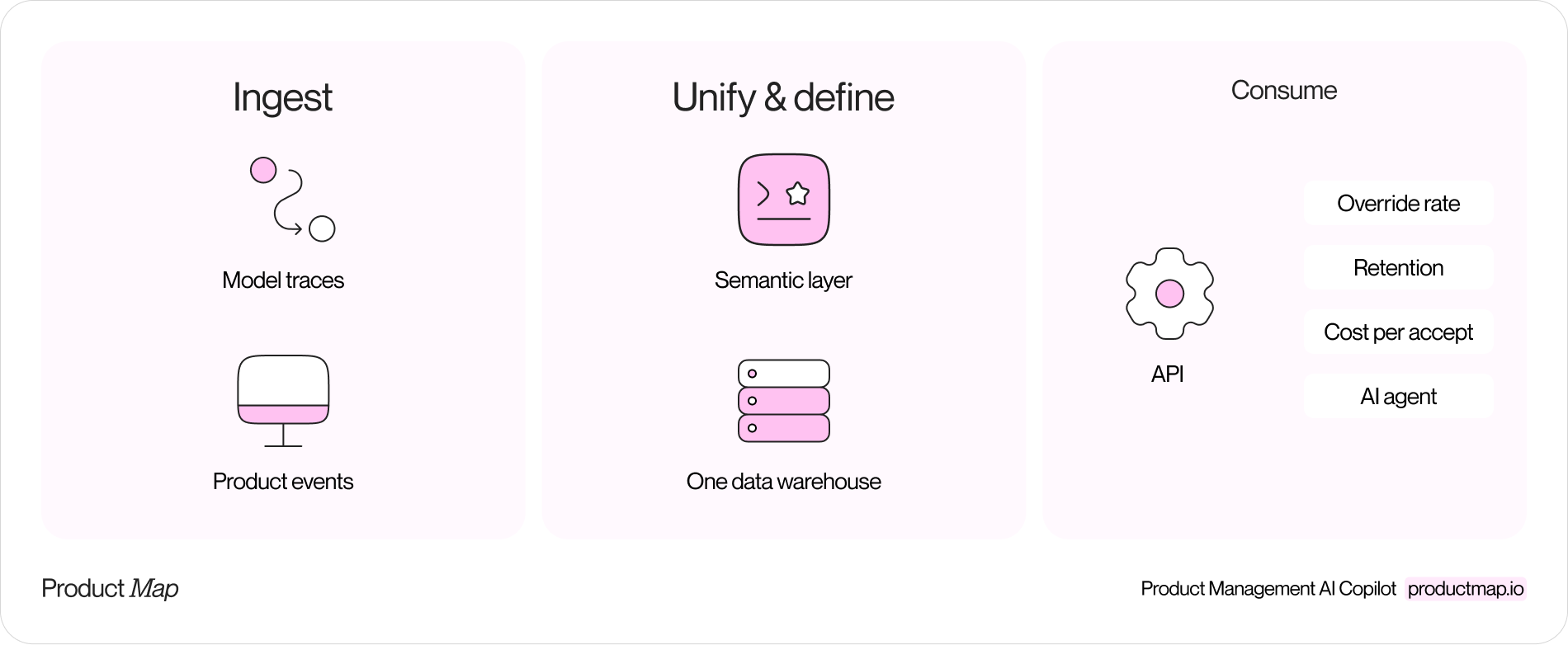
Headless analytics removes the fixed interface. Warehouse-native tools such as Kubit, NetSpring, and Mitzu run product analytics directly on Snowflake, BigQuery, or Databricks instead of copying events into their own store. Semantic layers such as Cube and dbt's metrics layer go further: they define metrics as code and expose them through an API, with no prescribed UI at all.
This architecture contributes two things AI product analytics depends on:
- One home for both layers. Model traces and behavioral events land in the same warehouse, so the join between model signals and user behavior is one query, not an export pipeline between two vendors' silos.
- Metrics as code. Override rate gets one definition, reviewed in git like any other change, and every chart built on it agrees. When the definition lives behind an API, an AI agent can read it and query it too.
The practical consequence is a shift in who designs the dashboard. With a packaged tool, the vendor decided years ago which charts exist, and your questions bend to fit them. With a headless setup, the team states its requirements, an override-rate trend split by model version, a drift alert wired to the eval schedule, a retention view per adoption cohort, and builds exactly that view, or has an agent draft it from the semantic layer in minutes. The dashboard stops being a screen you were given and becomes an artifact your team designs around the decisions it needs to make.
Instrument your AI feature
The measurement framework for a new AI feature comes together in six steps:
- Define what "worked" means. Before launch, write the success event in plain language: the user shipped the draft, ran the query, closed the ticket. If you can't name it, you'll end up counting generations and calling it adoption. The acceptance criteria section of an AI PRD is the natural place to pin this down.
- Log accept, edit, and reject on every generation. Attach user ID, session, model version, and prompt template ID to each event. This is the schema decision everything else depends on.
- Land both layers in one warehouse. Route model traces and product events to the same store, whether or not you adopt a headless tool on day one. Co-located data keeps the join cheap.
- Define the core metrics as code. Override rate, drift checks, adoption, and retention impact go into the semantic layer with one owner per metric.
- Build the dashboard to your requirements and set one alert. Start with a single view joining both layers, and wire an alert to the override-rate trend. That trend is your early warning system; retention confirms what override rate predicted weeks earlier.
- Close the loop. Every rejected or heavily edited generation is a labeled failure. Feed a sample into your eval set each week, so the test suite grows wherever the model disappoints real users.
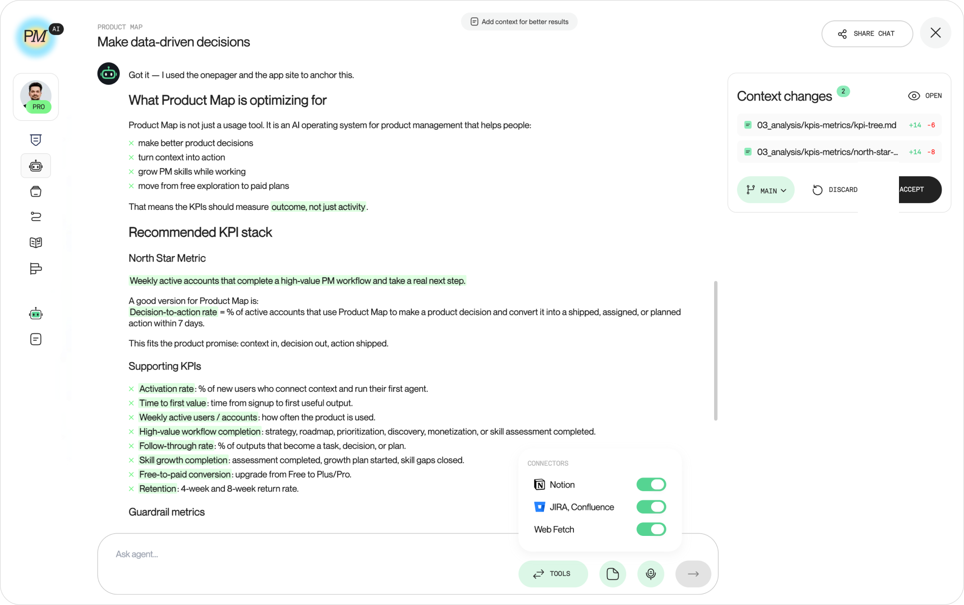
An agent can run most of this analysis with you. Product Map's data-driven decisions agent takes a metric question, pressure-tests the hypothesis behind it, and structures the analysis before you touch the warehouse.
The blind spot: agents are now part of your traffic
Here's the question senior operators are starting to ask and most analytics writeups skip: how many of your daily active users are people?
Every analytics stack assumes a human behind each session. In 2026 that assumption is quietly wrong. AI agents browse products, call APIs, and complete tasks on a user's behalf, and Imperva's bot research already puts automated traffic near half of all web traffic. Agent sessions inflate DAU, sail through funnels without hesitation, never scroll, and convert in patterns no human cohort produces. Left unclassified, they contaminate every metric downstream, including your A/B tests.
The fix is classification at ingestion, not cleanup at analysis. Tag agent-driven sessions as they arrive, report human and agent metrics as separate series, and decide explicitly which series your OKRs and pricing follow. An agent completing a task for a paying customer is real value delivered; it's not a person to count in engagement. Teams selling API-first or agent-accessible products should go one step further and treat agent traffic as its own segment with its own retention curve, because the agents' owners are the customers deciding whether to renew.
FAQ
How do you measure whether an AI feature is working?
Join three numbers: override rate (do users trust the output), retention impact (do adopters stick around longer than non-adopters), and unit cost per accepted generation (does the economics hold). A feature is working when override trends down, adopter retention separates upward, and cost per accepted output fits the margin. Any one number alone can look fine while the feature fails.
How often do AI models drift, and how do you catch it?
Treat drift as continuous rather than occasional; the Scientific Reports study found 91 percent of models degraded over time without retraining. Catch it with two instruments: scheduled eval runs against a fixed test set, and the override-rate trend split by cohort and model version. Override rate usually moves first, because users notice quality slips before your test set does.
Which metrics replace engagement scores for AI products?
Override rate replaces satisfaction proxies, task completion replaces time-in-feature, and adopter retention replaces raw DAU. Time spent is the most misleading of the old set: with an AI feature, less time to the same outcome is the win, so falling session length can be your best result of the quarter.
What are the privacy risks of AI product analytics?
Prompts and generations often contain personal or confidential data users would never type into a form, and now they sit in your traces and your warehouse. Scrub PII before traces land in storage, set short retention windows on raw generation logs, and keep prompt content out of third-party analytics vendors entirely; aggregate metrics travel, raw text stays home.
Start with the override rate
You don't need the full stack this quarter. Pick one AI feature, log accept, edit, and reject with model version attached, and put the trend on a dashboard your team defined. That single instrument catches most quality slides weeks before retention reacts, and every step after it, drift alerts, cohort joins, metrics as code, builds on the same three events.
The teams treating measurement as part of the AI feature, not an afterthought to it, are the ones whose dashboards stay honest. Green because it's checked, not green because nobody wired the signal that would turn it red.